
Customize Entity Detailed View
INTRODUCTION
You can customize the detailed view of an entity in any way, including:
- Hiding useless tabs, renaming existing tabs, or adding new tabs;
- Creating your own sections to group native and custom fields in the way you need.
As powerful as it is, view customization has its limitations.
To modify the detailed view, open Targetprocess Settings > Detailed Views menu item. Here you will find default layouts for every entity. These layouts are described in JSON format and contain the list of all tabs, sections, fields, and buttons, represented as components.
When you create a new component, there is no need to set componentID, it's generated automatically.
Every entity has its own default layout similar to the old non-customizable detailed view. You can always reset to the default template or disable customization completely. Each template defines the layout for the specific entity in the particular process (e.g., Features in the 'Kanban' process).
Not seeing Detailed Views option?
- Make sure you're a system administrator. If the only two options you see in the Settings are 'Diagnostic and Logs' and 'Import', that means you are not a system administrator.
- Detailed View customization might be temporarily disabled for your company's account for a certain reason. Make a request to [email protected] and we will inform you when enabling will be possible.
In this example, we'll be working with the Feature entity in the 'Scrum' process. To do so, we navigate to Targetprocess Settings > Detailed Views, and then select ‘Features’ in the entity dropdown and ‘Scrum’ in the process dropdown. Then we switch on using the customizable view. The default layout is loaded.

If there are punctuation or syntax errors in JSON, the layout editor will highlight the errors. The ‘Apply changes’ button will be disabled until you fix the problem. If something went wrong, you can restore the edited version to a default layout by clicking the ‘Restore to default’ button.
TABS
Tabs are defined in the sections component. Every tab has three parts:
title(title of the tab)titleExtra(counter for the title of the tab)component(content of the tab)
{
   "id":"tabs",
   "type":"sections",
   "location":"tabs",
   "sections":[
      {
         "title":{
            "type":"string",
            "value":"Relations",
            "localize":true
         },
         "titleExtra":{
            "type":"component",
            "component":"label.relationCount",
            "properties":{
               "text":""
            },
            "componentId":"component_v47vknl"
         },
         "component":{
            "type":"component",
            "component":"relations.container",
            "properties":{
               "name":"relations container"
            },
            "componentId":"component_0eye9w9"
         },
         "componentId":"section_nlbsdtj"
      },
      {
         "title":{
            "type":"string",
            "value":"History",
            "localize":true
         },
         "component":{
            "type":"component",
            "component":"auditHistory",
            "componentId":"component_uovrhva"
         },
         "componentId":"section_a6ede8w"
      }
   ],
   "componentId":"sections_smnpnfl"
}
Rename an existing tab
To rename a tab, modify the value of the title part. Let's rename the Flow tab to Change Log.
{
   "title":{
      "type":"string",
      "value":"Change Log",
      "localize":true
   },
   "component":{
      "type":"component",
      "component":"auditHistory",
      "componentId":"component_uovrhva"
   },
   "componentId":"section_a6ede8w"
}

Move an existing tab
Let’s move the tab called ‘Tests’ to the end. To do so we'll take the entire section and move it to the end of sections array.


After
Add a new tab
Let's move 'Lead & Cycle time' to a new tab. By default, it’s displayed as a collapsible component:
{
   "type":"collapsible",
   "title":{
      "type":"string",
      "value":"Lead cycle time",
      "localize":true
   },
   "component":{
      "type":"component",
      "component":"leadCycleTime",
      "properties":{
         "evictProperties":[
            "leadTime",
            "cycleTime"
         ]
      },
      "componentId":"component_qkvjg2l"
   },
   "componentId":"collapsible_x9y2yu3"
},
We'll transform it into a section component:
{
   "title":{
      "type":"string",
      "value":"Lead cycle time",
      "localize":true
   },
   "component":{
      "type":"component",
      "component":"leadCycleTime",
      "properties":{
         "evictProperties":[
            "leadTime",
            "cycleTime"
         ]
      }
   }
}

After
Remove existing tab
Let's remove the 'Test' tab:


Specify a tab that should be opened by default
You can specify which tab should be opened every time you open a card by adding the additional property “selected”.
Let's set the ‘Tasks’ tab be opened every time you open the User Story detailed view.

Add Flow tab to Extended Domain entity
Starting with Targetprocess version 2403.3 it's possible to add a Flow tab to Extended Domain entities.
{
                    "type": "section",
                    "title": {
                      "type": "string",
                      "value": "Flow",
                      "localize": true
                    },
                    "component": {
                      "type": "component",
                      "component": "implementationHistory"
                    }
                  },
Add an embedded page as a tab
You can see the pages by links you've provided in a URL and Template URL custom field as an additional tab on an entity view, so you can work with the external pages and documents in Targetprocess.
Let’s add a ‘Doc’ custom field under the ‘Effort’ object of the ‘Info’ section in JSON.

Now let's add a new tab called ‘Google Doc’ after the ‘Relations’ tab: add the whole object under the ‘Relations’ object in JSON.
{
  "title": {
    "type": "string",
    "value": "Google Doc"
  },
  "component": {
    "type": "embeddedPage",
    "customFieldName": "Doc"
  }
}

Go to the Feature detailed view and fill in the URL custom field with an external link (e.g. To a Google document). Magic!

Add an embedded Roadmap (Timeline) as a Tab
Add an embedded Board as a Tab
Add Task / Test Case Template
This component helps you to create a set of Test Cases or Tasks and add it to any User Story immediately. It works for any project, team, or process.
The component adds a tab to the User Story view. From this tab, you can create templates that contain tasks or test cases you need to apply to multiple user stories. After you create the template and the Tasks and/or Test Cases that you would like to use, they can be applied to any user story by going to the Template tab and selecting Apply Template.
Please add this component to User Story entity:
{
    "title": {
      "type": "string",
      "value": "Template",
      "localize": true
    },
    "component": {
      "type": "taskTestCaseTemplate"
    }
 }
Let’s add a ‘Template’ tab before the ‘Tests’ tab:


Allow Persistent Content in Tabs
By default, every time you switch to another tab, its content is requested from the backend. This request takes some (short) time and causes the System to show you a spinner. You can turn this behavior off and make the System cache all the tabs for the currently opened entity. Then tab content becomes persistent: each tab is only requested once; and when you switch back to it after switching to other tabs, it shows its content immediately, without re-requesting and re-rendering.
To allow persistent tab content, use the "cacheOpenedTabs" property in the component with "type": "sections", which contains your tabs. Set the property to "true". (It is considered "false" by default.)
{
                "id": "tabs",
                "type": "sections",
                "location": "tabs",
                "cacheOpenedTabs": "true",
                "sections": [

                    // YOUR TABS HERE...

                ]
              }
Note that if there’s a large number of Inner Lists in tabs, then setting this property to "true" may result in significant load on live updates. If you’re experiencing problems with live updates, or with the general performance of your browser or your device, try setting "cacheOpenedTabs" to "false".
BLOCKS IN THE RIGHT COLUMN
Remove a block
Now let’s customize the right panel of the view. To remove the section ‘Lead cycle time’ just delete the whole object with "value": "Lead cycle time".


Add a block
Do you want to group date fields into a new section? To ensure you don’t lose JSON formatting, duplicate any section e.g. ‘Info’, give a name to the new section by editing "value": "Info" string. Delete fields that are useless for this section by removing the whole object related to each field from JSON.


Add a section for DevOps Integrations
To see Branches and Merge/Requests, related to any Targetprocess entity ID, you must have this entity type's view customized.
This code will add a new block to the right panel:
{
   "type": "devops-info/v2",
   "component": "DevOpsInfoV2",
   "componentId": "devops_component"
 },
Let's add it below the 'Assignments' section:

Add a section for integration with Jira
To see information related to Jira integration use the following code:
{
  "type": "work-sharing-v2/v2",
    "component": "WorkSharingInfoComponentV2",
    "componentId": "work_sharing_component"
},
Add a TestRail block
This component works together with TestRail Integration. The code adds a new tab that will show the list of Test Cases from TestRail.
{
   "title": {
      "type": "string",
      "value": "TestRail",
      "localize": false
   },
   "component": {
      "type": "testrail-list",
      "component": "TestRailTestCasesComponent",
      "componentId": "testrail_testcases"
   },
"componentId": "section_testrail"
},
Add a Direct Access block
This component allows to control user access permissions to entities:
{"type": "direct-access-component"},
FIELDS
Hide fields
Note that fields hidden from view are still available through API v.2, so it's not a good idea to hide fields for security reasons in this way.
As date fields are already shown in the new ‘Dates’ section, let's remove them from the ‘Info’ section: delete complete objects of fields from ‘Info’ array.


Rename native field
Do not rename native fields via the layout editor, as it affects only the detailed view, not all views across the system, and leads to inconsistency.
Add custom field
Custom field of a type Targetprocess Multiple Entity is not supported
Please add your vote for the corresponding idea if you'd like to display a custom field of this type.
Let’s add the custom field ‘Extra’ under the ‘Owner’ field of the ‘Info’ section. Do not forget to add this field in Targetprocess Settings > Custom Fields menu item. Now add the whole object under ‘Owner’ object in JSON.
{
                  "type": "property.customField",
                  "properties": {
                    "name": "Extra"
                  }
                }


Rename custom field
If you want to rename an existing custom field, add additional property label inside properties. label should include "type":"string" and value with the necessary name.
{
   "type":"property.customField",
   "properties":{
      "name":"Custom Field Name",
      "label":{
         "type":"string",
         "value":"Updated Name",
         "localize":true
      }
   },
   "componentId":"property.customField_0gustmk"
}

Hide custom field
{
   "type":"property.customField",
   "properties":{
      "name":"Cost Type"
   },
   "visibilityConfig":{
      "entityQuerySelector":"false"
   }
}
Add a custom field of rich text type
A custom field of rich text type is usually added in the main part of the view because it needs a lot of space. Let's put an ‘Additional info’ field on the ‘Info’ tab under the ‘Description’ object in JSON.


Make a field read-only
Replace "editable": true, with "editable": false,
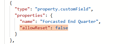
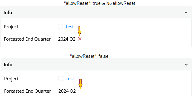
Disable reset
By adding "allowReset": false,once some value is set it won't accept empty value or have X to reset it.
Add a tooltip
A tooltip component can be assigned to any label
{
   "type": "property.plannedEndDate.assignable",
   "properties": {
      "label": {
         "type": "string",
         "value": "Planned end",
         "localize": true
      },
      "editable": true,
      "tooltip": "HEre!"
   },
   "componentId": "property.plannedEndDate.assignable_nl5etxp"
   },

LAYOUT
Grid
It is also possible to add a Grid containing specific values, e.g. Custom fields of the entity:

{
  "type": "grid",
  "columns": [
    "auto",
    "auto",
    "auto"
  ],
  "rows": [
    "auto",
    "auto"
  ],
  "components": [
    {
      "gridRow": 1,
      "gridColumn": 1,
      "type": "property.customField",
      "properties": {
        "name": "Select your pet"
      },
      "componentId": "property.customField_h9ow2c2"
    },
    {
      "gridRow": 1,
      "gridColumn": 2,
      "type": "property.customField",
      "properties": {
        "name": "Select your pet"
      },
      "componentId": "property.customField_20bua0m"
    },
    {
      "gridRow": 1,
      "gridColumn": 3,
      "type": "property.customField",
      "properties": {
        "name": "Select your pet"
      },
      "componentId": "property.customField_6kf34yv"
    },
    {
      "gridRow": 2,
      "gridColumn": 1,
      "type": "property.customField",
      "properties": {
        "name": "Select your pet"
      },
      "componentId": "property.customField_ppm9uf6"
    },
    {
      "gridRow": 2,
      "gridColumn": 3,
      "type": "property.customField",
      "properties": {
        "name": "Select your pet"
      },
      "componentId": "property.customField_qoa5oaj"
    }
  ],
  "componentId": "grid_7p9bi2i"
}
Stack
If you want to have multiple fields/components/etc inside the collapsible, you can make this component as stack so that you can place an arbitrary number of children in it


{
                    "title": {
                      "type": "string",
                      "value": "Defenition of Done",
                      "localize": true
                    },
                    "component": {
                      "type": "stack",
                      "orientation": "column",
                      "components": [
                        {
                          "type": "property.customField",
                          "properties": {
                            "name": "Select your pet"
                          },
                          "componentId": ""
                        },
                        {
                          "type": "property.customField",
                          "properties": {
                            "name": "Remain Developer"
                          },
                          "componentId": ""
                        },
                        {
                          "type": "property.customField",
                          "properties": {
                            "name": "Default or not"
                          },
                          "componentId": ""
                        }
                      ],
                      "componentId": ""
                    },
                    "componentId": "",
                    "type": "section"
                  }
Collapsible
You may also configure collapsible tabs with the custom or other fields. You will only need to replace Custom Field names and titles with the ones you need:
.png")
.png")
{
                    "title": {
                      "type": "string",
                      "value": "Cost benefit",
                      "localize": true
                    },
                    "component": {
                      "type": "stack",
                      "orientation": "column",
                      "components": [
                        {
                          "type": "collapsible",
                          "title": {
                            "type": "string",
                            "value": "First Custom Fields set",
                            "localize": true
                          },
                          "component": {
                            "type": "stack",
                            "orientation": "column",
                            "components": [
                              {
                                "type": "property.customField",
                                "properties": {
                                  "name": "Select your pet"
                                },
                                "componentId": ""
                              },
                              {
                                "type": "property.customField",
                                "properties": {
                                  "name": "Remain Developer"
                                },
                                "componentId": ""
                              },
                              {
                                "type": "property.customField",
                                "properties": {
                                  "name": "Default or not"
                                },
                                "componentId": ""
                              }
                            ],
                            "componentId": "stack_9dfo0xr"
                          },
                          "componentId": "collapsible_6hw534j"
                        },
                        {
                          "type": "collapsible",
                          "title": {
                            "type": "string",
                            "value": "Second Custom Fields set",
                            "localize": true
                          },
                          "component": {
                            "type": "stack",
                            "orientation": "column",
                            "components": [
                              {
                                "type": "property.customField",
                                "properties": {
                                  "name": "Probability"
                                },
                                "componentId": ""
                              },
                              {
                                "type": "property.customField",
                                "properties": {
                                  "name": "Tested"
                                },
                                "componentId": ""
                              },
                              {
                                "type": "property.customField",
                                "properties": {
                                  "name": "Due Date"
                                },
                                "componentId": ""
                              }
                            ],
                            "componentId": "stack_iuphs2j"
                          },
                          "componentId": "collapsible_qynefma"
                        },
                        {
                          "type": "collapsible",
                          "title": {
                            "type": "string",
                            "value": "Third Custom Fields set",
                            "localize": true
                          },
                          "component": {
                            "type": "stack",
                            "orientation": "column",
                            "components": [
                              {
                                "type": "",
                                "properties": {
                                  "name": "Entity Release"
                                },
                                "componentId": ""
                              },
                              {
                                "type": "property.customField",
                                "properties": {
                                  "name": "Simulated Effort"
                                },
                                "componentId": ""
                              },
                              {
                                "type": "property.customField",
                                "properties": {
                                  "name": "AuthDate"
                                },
                                "componentId": ""
                              }
                            ],
                            "componentId": ""
                          },
                          "componentId": ""
                        }
                      ],
                      "componentId": ""
                    },
                    "componentId": ""
                  }
Making Collapsibles (un)collapsed by default
You can define the behavior of a Collapsible in respect of being collapsed or expanded at every opening of the page. This is controlled by the "defaultState" property which has 3 possible values: "collapsed", "uncollapsed", "user" (the default one).
With "defaultState": "collapsed", the Collapsible will always be collapsed after the page is loaded or refreshed. A last change of this state – i.e. if the User expands the Collapsible – persists until page refresh; which means that switching between tabs won’t revert the state to collapsed.
With "defaultState": "uncollapsed", the Collapsible will always be uncollapsed (i.e. expanded) after the page is loaded or refreshed. As with the "collapsed" value above, a last change of this state by the User persists until page refresh.
If "defaultState" is set to "user" or not specified, then on refresh, the Collapsible has the same state (collapsed or expanded) in which the User left it before the refresh.
Note that this property works both for Collapsibles in tabs and Collapsibles in the right column – more exactly, for any layout component of type "collapsible".
Here is an example snippet of a Collapsible which is collapsed by default:
{
    "type": "collapsible",
    "title": {
        "type": "string",
        "value": "Short Description",
        "localize": true
    },
    "component": {
        "type": "stack",
        "components": [
            {
                "type": "description"
            }
        ],
        "orientation": "column"
    },
    "properties": {
        "defaultState": "collapsed"
    }
}
And here’s how this Collapsible behaves:

The "Short Description" Collapsible is collapsed on page reload, i.e. by default.
Add a horizontal line
You can add a horizontal line to separate fields from each other:
{
	"type": "separator"
}
Let’s add a separator under the ‘Description’ field:


Add a space
You can separate fields from each other by adding an additional space:
{
   "type": "space"
}
Let’s add a space under the ‘Description’ field:


Add simple Text
Together with a Collapsible sections Header, you can add custom text to the customized entity view.
You will need just paste the JSON between the required sections:


{
      "type": "component",
      "component": "label",
      "properties": {
         "text": "This is the Header",
         "cssClass": "bold"
      },
      "componentId": ""
   },
   {
      "type": "component",
      "component": "label",
      "properties": {
         "text": "Use them well",
         "cssClass": "normal"
      },
      "componentId": ""
   }
HIDE FIELDS AND TABS ON CONDITION
You can show fields on the detailed view depending on user role or on values in other fields.
It does not imply permissions. Technically, all fields are available for reading and writing via API and all fields can be shown on boards. This is only for simplifying or uncluttering the view for a specific role, not for setting permissions or access control.
If
visibilityConfigis specified several times, they will be combined together usingAND, i.e. a user must have both the specified roles as a user and one of the specified roles as project assignment.
Based on the user's project role
"visibilityConfig": {
  "showForProjectRoles": [
     "Support Person",
     "Top Manager"
  ]
}
Based on the default user role
"visibilityConfig": {
  "showForUserRoles": [
     "Developer",
     "QA Engineer"
  ]
}
Based on values in other fields
"visibilityConfig": {
    "entityQuerySelector": "<any selector>"
}
Any APIv2 selector can be used.
For example:
- Only show if “checkboxCF” checkbox custom field is true: checkboxCF==true
- Only show if team with ID 44 is assigned: assignedTeams.where(team.id==44).count()>0
- Only show for non-final entity state: entityState.isFinal==false
Let’s show the ‘Description’ tab only when team with id=185765 is assigned to entity:


Based on the process's Practises
If the corresponding practice is turned off, then the element does not display:
"visibilityConfig": {
                      "requiredPractices": [
                        "Test Cases"
                      ]
                    }
"Time Tracking" practice - "Times",
"Bug Tracking" practice - "Bugs",
"Requests" practice - "Help Desk",
"Test Cases", "Source Control", "Iterations", "Features", "Epics", and "Portfolio Epics".

Updated 12 months ago