Embedded Roadmap view customization
This document describes how to add and customize a Roadmap view to an Entity detailed view
We added the possibility of embedding a Roadmap into an entity detailed view. Let say, you embed a Roadmap with Features to an Epic detailed view. Now you can plan all your work inside any Epic detailed view, drag-n-drop cards, prioritize and open them, with no need to create additional views in the lefthand menu.
Roadmaps can be added and configured on detailed views only by Administrators. Within system settings, add the roadmap.configurator component into JSON with the set of properties: cards filtering and customization, lanes setting, the source of milestones configuration, etc.
Add a tab with a Roadmap view on an entity detailed view
Go to Settings > Detailed views, select a required entity from a specific process, paste JSON 1 in a place you want to add a new tab with an embedded Roadmap view, and press the Save button.
{
  "title": {
    "type": "string",
    "value": "Roadmap",
    "localize": true
  },
  "component": {
    "type": "component",
    "component": "roadmap.configurator"
  }
Close the settings page and open any entity of the chosen type. You should see a new tab with a blank Roadmap view.
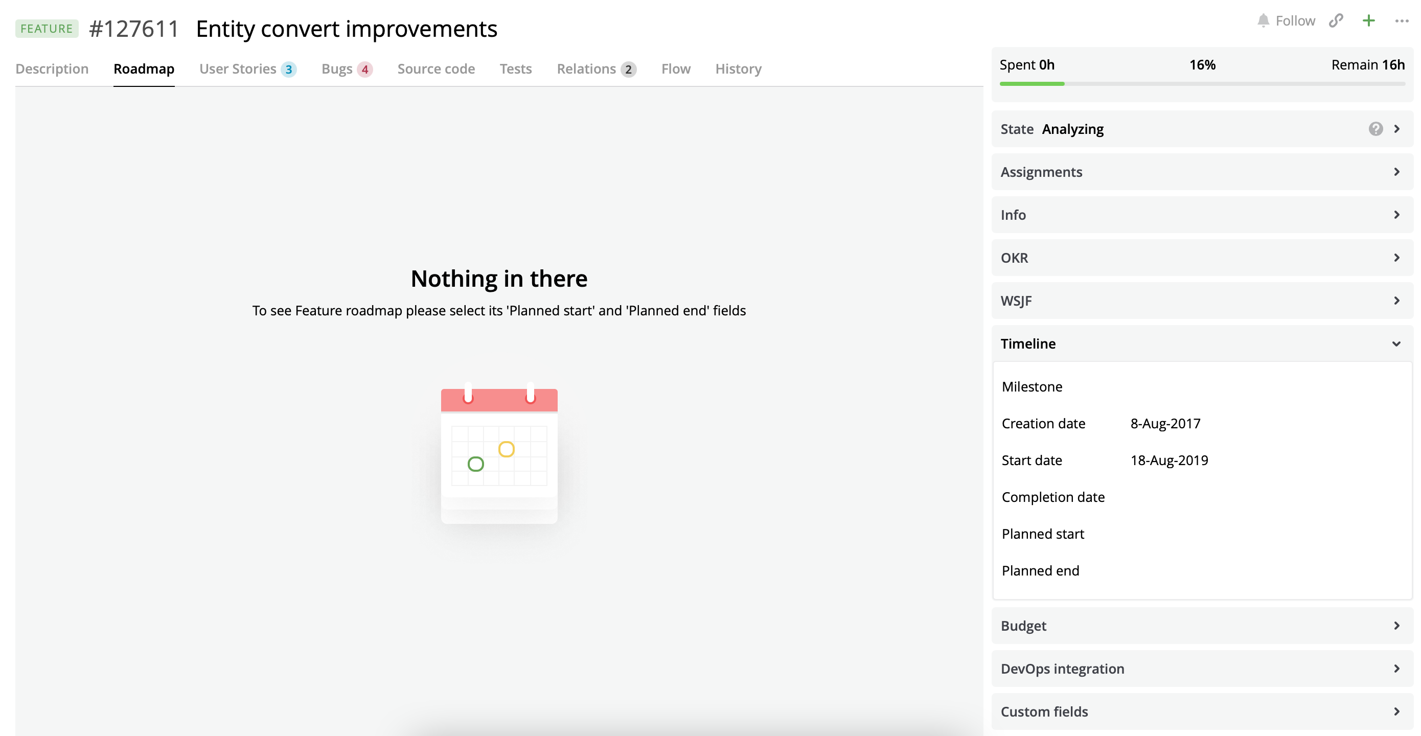
Embedded non-setted up Roadmap view.
Configure the embedded Roadmap view
Embedded Roadmap views do not show any cards by default. You can set it up by providing configuration via the properties field. The available properties are listed in JSON 2.
"properties": {
  "cardTypes": string[],
  "startDateSelector": string,
  "endDateSelector": string,
  "cardFilter": string,
  "dateScale": string,
  "hideEmptyLanes": boolean,
  "zoomLevel": string,
  "cardSettings": Object,
  "hintCardSettings": Object,
  "globalDateRangeCalculation": {
    "daysBeforePlannedStartDate": integer,
    "daysAfterPlannedEndDate": integer
  },
  "showProjectMilestone": boolean,
  "milestoneProviders": [
    {
      "entityTypeName": string,
         "nameOfDateField": string,
      	 "filter": string,
         "color": string
    }
  ]
}
Configure period of the embedded Roadmap view
You can set start and end dates for the embedded Roadmap view via startDateSelector and endDateSelector properties.
These properties are optional, PlannedStartDate and PlannedEndDate of the current entity will be taken by default.
This selector uses api v2 for obtaining value by replacing parts of an api request.
E.g., the JSON below selects Start date and End date of a current entity to build a Roadmap view:
{
  "startDateSelector": "StartDate",
  "endDateSelector": "EndDate"
}
The JSON below selects 1 month before Start date of a current entity in the past and 10 days after End date of a current entity to build a Roadmap view:
{
  "startDateSelector": "StartDate.AddMonths(-1)",
  "endDateSelector": "EndDate.AddDays(10)"
}
Let's say we need to embed a Roadmap view for a Feature entity with the start date as the earliest Planned start date among all related Bugs. And end date as the latest Planned end date among all related Bugs:
{
  "startDateSelector": "Bugs.OrderBy(PlannedStartDate).First.PlannedStartDate",
  "endDateSelector": "Bugs.OrderByDescending(PlannedEndDate).First.PlannedEndDate"
}
Set the types of cards displayed on the embedded Roadmap view
You can specify what cards should be displayed on the embedded Roadmap view via cardTypes property. cardTypes is an array of entity type names. The value can be: bug, userstory, epic, feature, impediment, iteration, portfolioepic, project, release, request, task, teamiteration, testplan, testplanrun.
{
  "title": {
    "type": "string",
    "value": "Roadmap",
    "localize": true
  },
  "component": {
    "type": "component",
    "component": "roadmap.configurator",
    "properties": {
      "cardTypes": [
        "userstory",
         "bug"
      ],
      "startDateSelector": "PlannedStartDate",
      "endDateSelector": "PlannedEndDate"
    }
  }
}
By default, the Roadmap view displays all entities from the Project of the current entity.
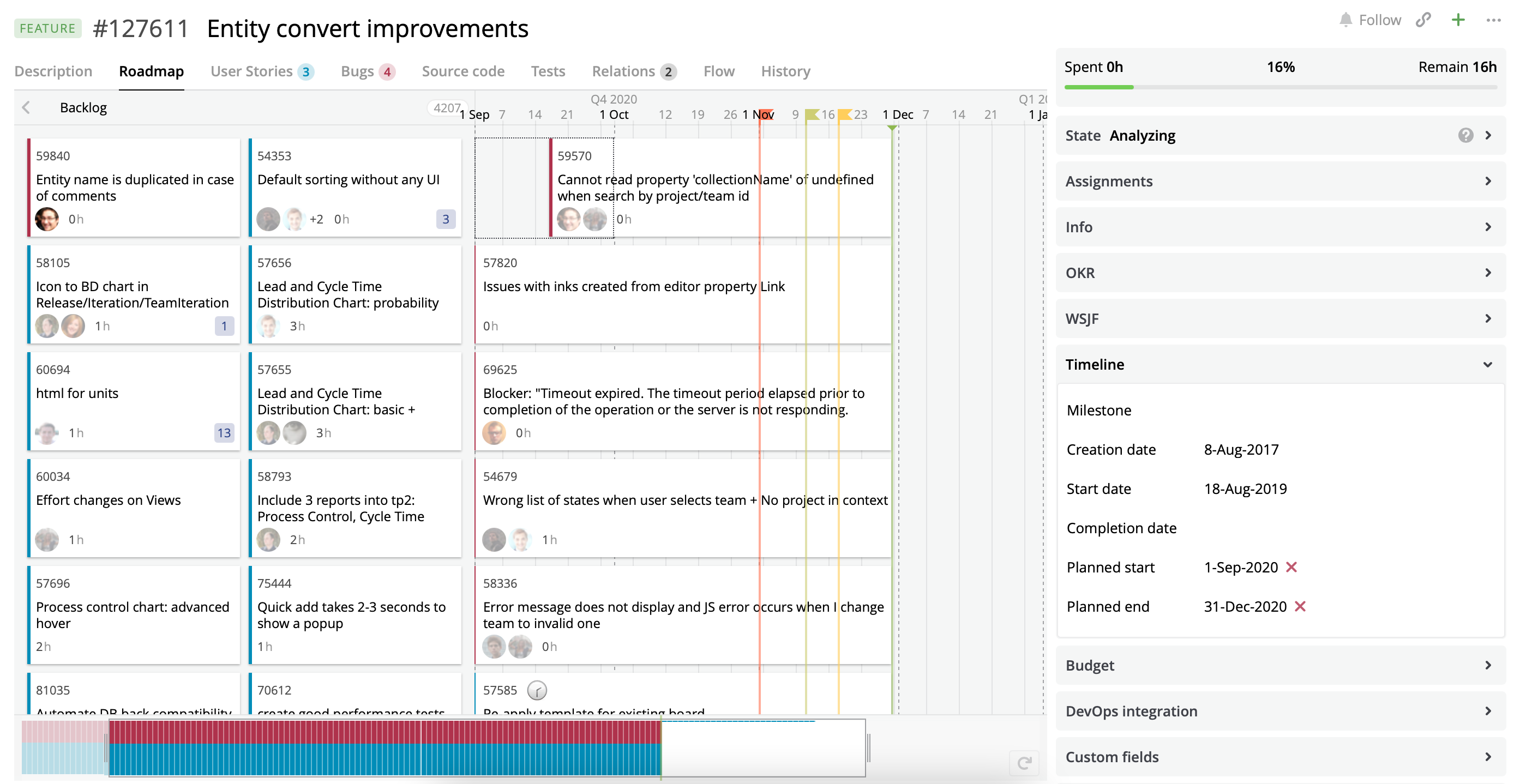
A Roadmap view with User Stories and Bugs assigned to the Project of the current Feature with set Planned dates.
Filter cards displayed on the embedded Roadmap view
You can specify the DSL filter into the cardFilter property to reduce the number of visible cards.
In some cases, users need to specify the id of the current entity in the DSL filter. For this purpose use ${entity.id} pattern in the DSL filter. When the user opens an entity detailed view Targetprocess will replace ${entity.id} with the real entity id. E.g. an administrator user specifies "?Feature.Id is ${entity.id}" as cardFilter. The user opens an entity with id 1048. Then the system replaces "?Feature.Id is ${entity.id}" with "?Feature.Id is 1048".
Configure period of the navigation time
A Roadmap view calculates the boundaries of the navigation time period by the following algorithm: the start date is calculated by subtracting two weeks from the Roadmap start date; the end date is calculated by adding four weeks to the Roadmap end date.
{
  "title": {
    "type": "string",
    "value": "Roadmap",
    "localize": true
  },
  "component": {
    "type": "component",
    "component": "roadmap.configurator",
    "properties": {
      "cardTypes": [
        "userstory",
        "bug"
      ],
      "startDateSelector": "PlannedStartDate",
      "endDateSelector": "PlannedEndDate",
      "cardFilter": "?Feature.Id is ${entity.id}"
    }
  }
}
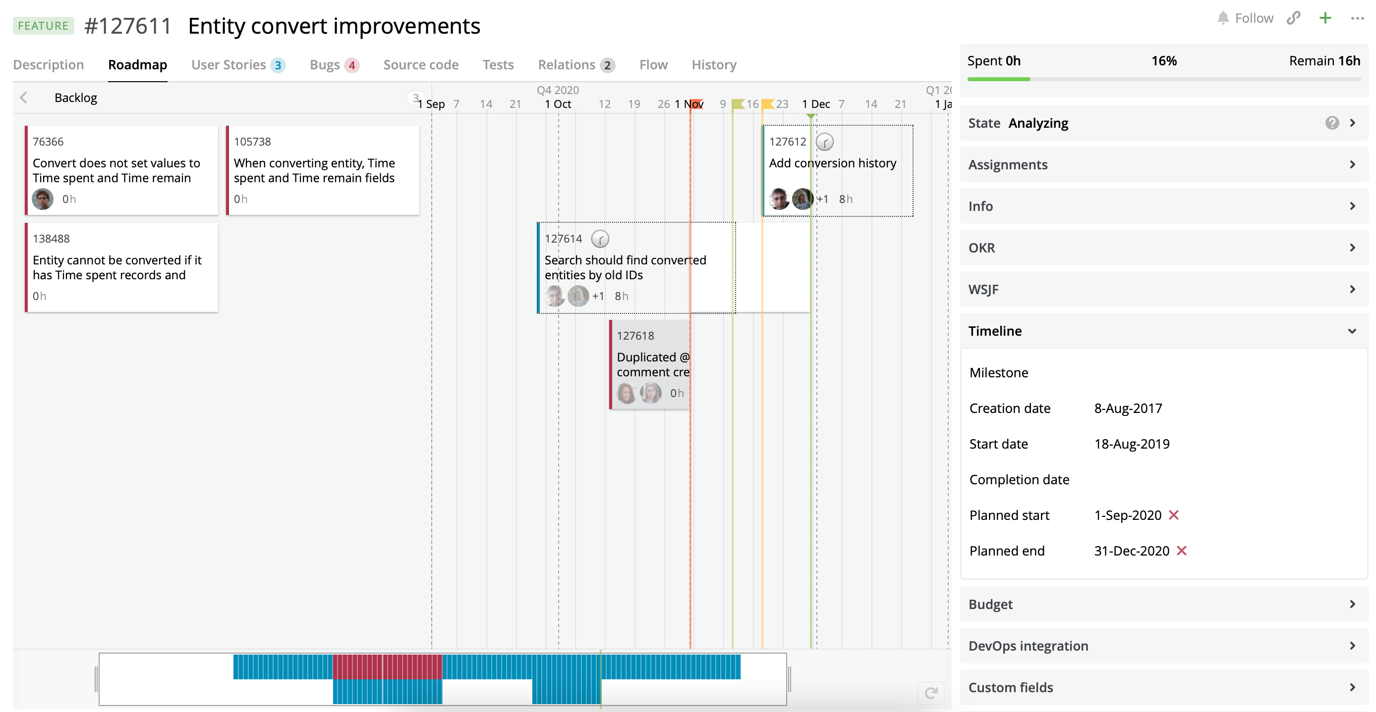
A Roadmap view with User Stories and Bugs assigned to the current Feature.
We have added the globalDateRangeCalculation property to provide the ability to customize the period of the navigation time. The property has two fields: daysBeforePlannedStartDate and daysAfterPlannedEndDate. These fields allow you to customize the start and end dates for the period of the navigation time. The start date is calculated by subtracting daysBeforePlannedStartDate days from the Roadmap start date. The end date is calculated by adding daysAfterPlannedEndDate days to the Roadmap end date.
{
  "title": {
    "type": "string",
    "value": "Roadmap",
    "localize": true
  },
  "component": {
    "type": "component",
    "component": "roadmap.configurator",
    "properties": {
      "cardTypes": [
        "userstory",
        "bug"
      ],
      "startDateSelector": "PlannedStartDate",
      "endDateSelector": "PlannedEndDate",
      "cardFilter": "?Feature.Id is ${entity.id}",
      "globalDateRangeCalculation": {
        "daysBeforePlannedStartDate": 40,
        "daysAfterPlannedEndDate": 75
      }
    }
  }
}
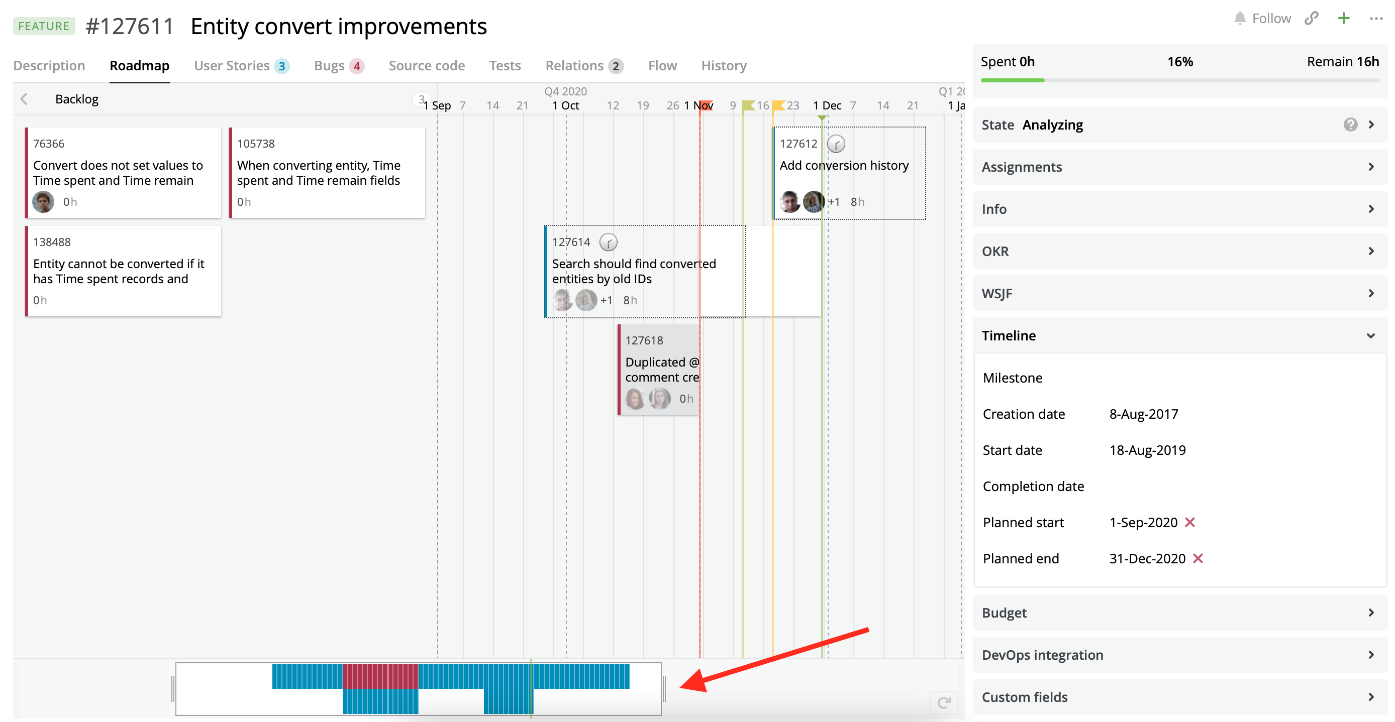
A Roadmap view with User Stories and Bugs assigned to the current Feature with the configured period of the navigation time.
Set vertical swimlanes
You can set up vertical swimlanes by setting the dateScale property. It can be one of the following values: none, halfyear, iteration, month, plannedenddate, quarter, release, teamiteration, week. By default, it is set to month.
{
  "title": {
    "type": "string",
    "value": "Roadmap",
    "localize": true
  },
  "component": {
    "type": "component",
    "component": "roadmap.configurator",
    "properties": {
      "cardTypes": [
        "userstory",
        "bug"
      ],
      "startDateSelector": "PlannedStartDate",
      "endDateSelector": "PlannedEndDate",
      "cardFilter": "?Feature.Id is ${entity.id}",
      "globalDateRangeCalculation": {
        "daysBeforePlannedStartDate": 40,
        "daysAfterPlannedEndDate": 75
      },
      "dateScale": "quarter"
    }
  }
}
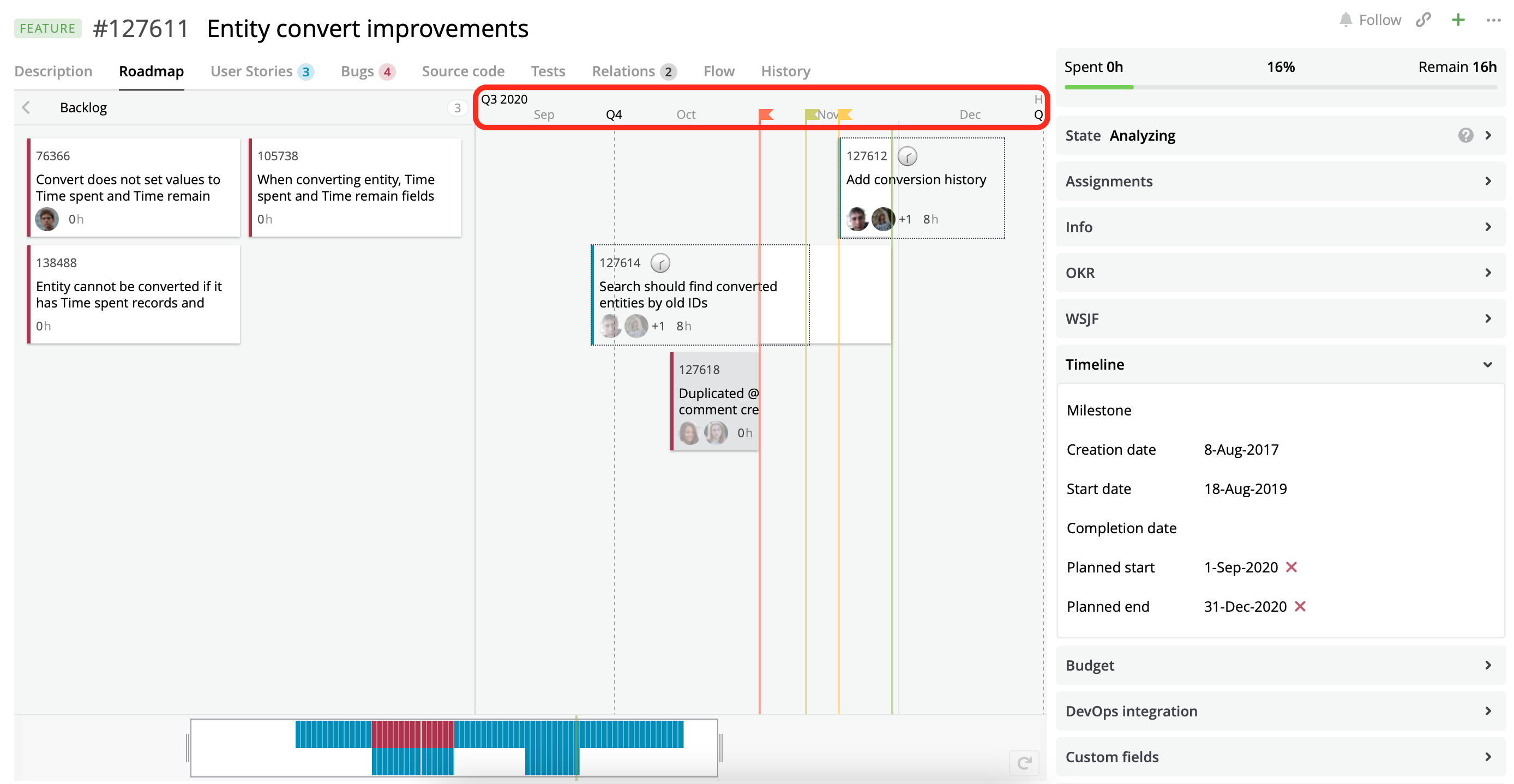
A Roadmap view with the quarter date scale.
Set horizontal swimlanes
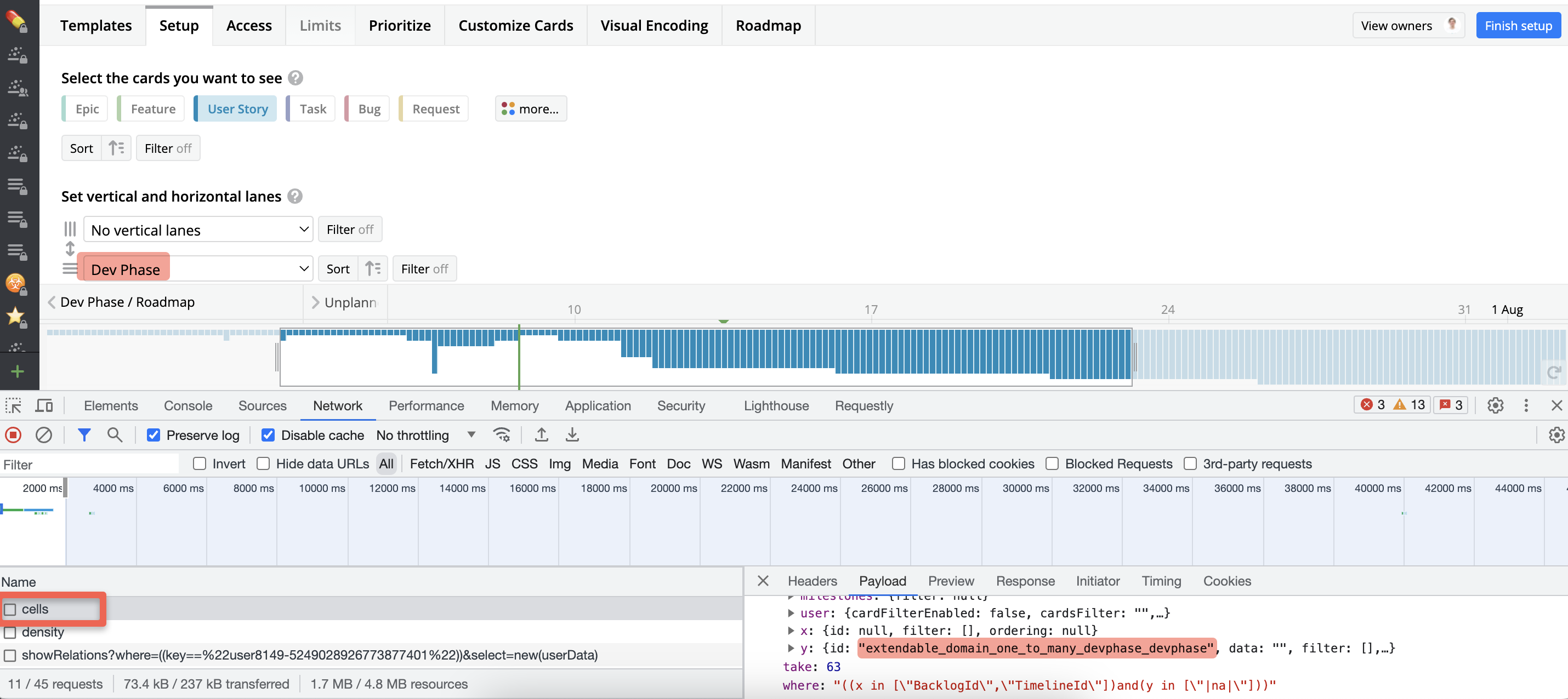
You can set up horizontal swimlanes by setting the horizontalLane property. It can be one of the following values: none, build, priority, createdate, enddate, entitytype, epic, halfyear, inboundrelations, milestone, modifydate, month, outboundrelations, owner, assigneduser, plannedenddate, plannedstartdate, portfolioepic, program, project, quarter, release, responsibleteam, startdate, entitystate, tag, team, teamiteration, teamentitystate, week, year. By default, it is set to none.
Or you can find the required value in the Network tab of the Dev Tools in the browser. To do this you need to build a roadmap view that you are going to embed and check the Cells request payload:
{
  "title": {
    "type": "string",
    "value": "Roadmap",
    "localize": true
  },
  "component": {
    "type": "component",
    "component": "roadmap.configurator",
    "properties": {
      "cardTypes": [
        "userstory",
        "bug"
      ],
      "startDateSelector": "PlannedStartDate",
      "endDateSelector": "PlannedEndDate",
      "cardFilter": "?Feature.Id is ${entity.id}",
      "globalDateRangeCalculation": {
        "daysBeforePlannedStartDate": 40,
        "daysAfterPlannedEndDate": 75
      },
      "dateScale": "quarter",
      "horizontalLane": "priority"
    }
  }
}
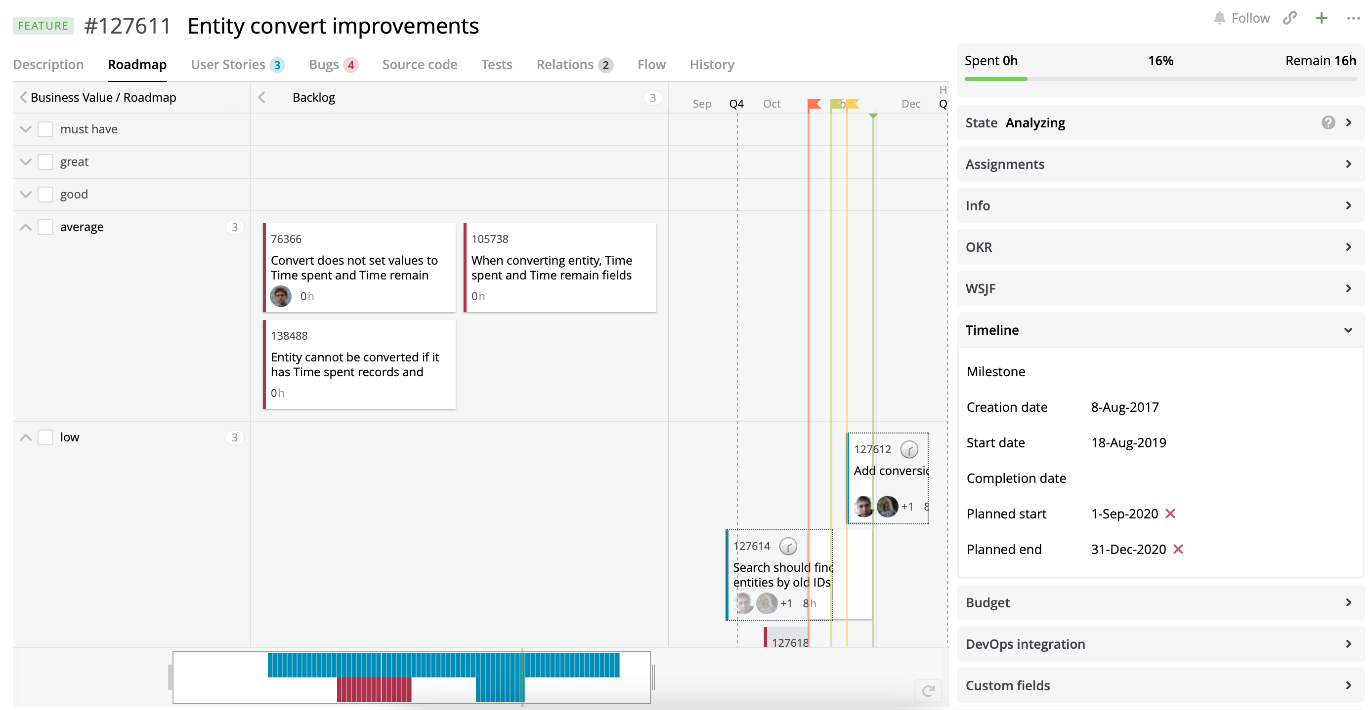
A Roadmap view with priority selected as a horizontal lane.
You can hide empty lanes via hideEmptyLanes property.
{
  "title": {
    "type": "string",
    "value": "Roadmap",
    "localize": true
  },
  "component": {
    "type": "component",
    "component": "roadmap.configurator",
    "properties": {
      "cardTypes": [
        "userstory",
        "bug"
      ],
      "startDateSelector": "PlannedStartDate",
      "endDateSelector": "PlannedEndDate",
      "cardFilter": "?Feature.Id is ${entity.id}",
      "globalDateRangeCalculation": {
        "daysBeforePlannedStartDate": 40,
        "daysAfterPlannedEndDate": 75
      },
      "dateScale": "quarter",
      "horizontalLane": "priority",
      "hideEmptyLanes": true
    }
  }
}
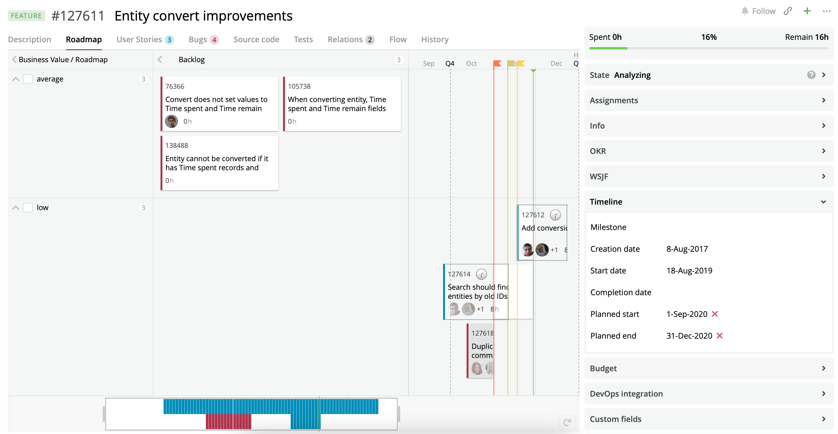
A Roadmap view with hidden empty horizontal lanes.
You can filter horizontal lanes via horizontalLaneFilter property.
{
  "horizontalLaneFilter": "?Name.Contains('must have') or Name.Contains('great')"
}
{
  "horizontalLane": "assigneduser",
  "horizontalLaneFilter": "?Assignables.Where(Feature.Id is ${entity.id})"
}
Set a size of cards displayed on the Roadmap view
You can set up the size of a card by setting the zoomLevel property. It can be one of the following values: xs, s, m, l. By default, it is set to m.
- x - only basic info, just one line. Could be a card name or id;
- s - a bit more info fits in here: two lines, e.g., a card name + avatars of assigned people;
- m - still more info: three lines. Could be a card name + tags + avatars and time spent;
- l - size for the detailed info. Unlimited lines. It's also used for hints.
{
  "title": {
    "type": "string",
    "value": "Roadmap",
    "localize": true
  },
  "component": {
    "type": "component",
    "component": "roadmap.configurator",
    "properties": {
      "cardTypes": [
        "userstory",
        "bug"
      ],
      "startDateSelector": "PlannedStartDate",
      "endDateSelector": "PlannedEndDate",
      "cardFilter": "?Feature.Id is ${entity.id}",
      "globalDateRangeCalculation": {
        "daysBeforePlannedStartDate": 40,
        "daysAfterPlannedEndDate": 75
      },
      "dateScale": "quarter",
      "horizontalLane": "priority",
      "hideEmptyLanes": true,
      "zoomLevel": "s"
    }
  }
}
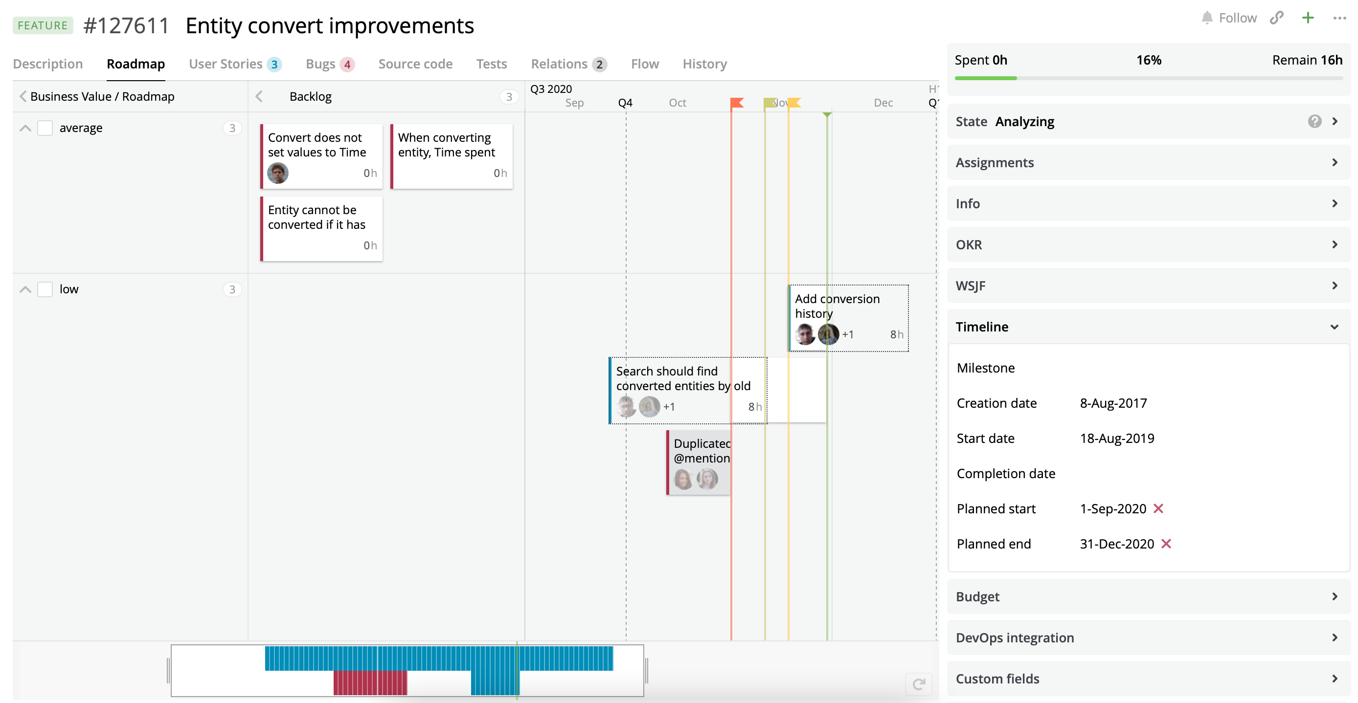
A Roadmap view with the card's size set to S.
Customize cards displayed on the Roadmap view
Targetprocess allows users to customize cards via its user interface. We have added the ability to customize cards on an embedded roadmap view via the cardSettings property.
{
  "title": {
    "type": "string",
    "value": "Roadmap",
    "localize": true
  },
  "component": {
    "type": "component",
    "component": "roadmap.configurator",
    "properties": {
      "cardTypes": [
        "userstory"
      ],
      "cardSettings": {
        "userstory": [
          [
            {
              "id": "general_entity_id",
              "alignment": "base"
            },
            {
              "id": "project_abbr",
              "alignment": "alt"
            }
          ],
          [
            {
              "id": "entity_name_small_sizes"
            }
          ]
        ]
      }
    }
  }
}
According to JSON 9, the User Story's card layout consists of two rows. The first row has two units: general_entity_id to the left (base) and project_abbr align to the right (alt). The second row has only one entity_name_small_sizes unit.
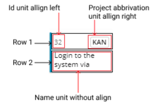
Customized User Story's card layout
You can read how to get the id of a specific unit in the Advanced Сustomization: customize inner lists guide.
{
  "title": {
    "type": "string",
    "value": "Roadmap",
    "localize": true
  },
  "component": {
    "type": "component",
    "component": "roadmap.configurator",
    "properties": {
      "cardTypes": [
        "userstory",
        "bug"
      ],
      "startDateSelector": "PlannedStartDate",
      "endDateSelector": "PlannedEndDate",
      "cardSettings": {
        "userstory": [
          [
            {
              "id": "general_entity_id",
              "alignment": "base"
            },
            {
              "id": "project_abbr",
              "alignment": "alt"
            }
          ],
          [
            {
              "id": "entity_name_small_sizes"
            }
          ]
        ],
        "bug": [
          [
            {
              "id": "assigned_users",
              "alignment": "base"
            }
          ],
          [
            {
              "id": "entity_name_small_sizes"
            }
          ]
        ]
      },
      "cardFilter": "?Feature.Id is ${entity.id}",
      "globalDateRangeCalculation": {
        "daysBeforePlannedStartDate": 40,
        "daysAfterPlannedEndDate": 75
      },
      "dateScale": "quarter",
      "horizontalLane": "priority",
      "hideEmptyLanes": true,
      "zoomLevel": "s"
    }
  }
}
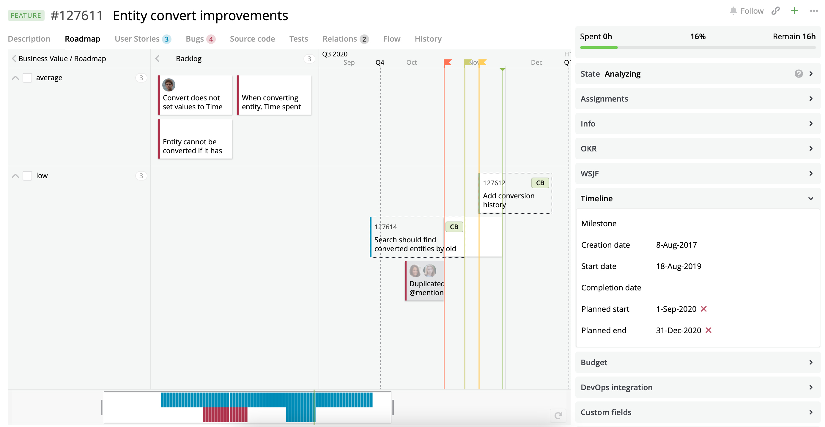
A Roadmap view with the customized cards for User Stories and Bugs.
Customize a card displayed on a hover
We have added the ability to customize cards displayed on hover on the embedded Roadmap view via the hintCardSettings property.
To make it work, make sure that:
cardSettingsparameter is present in the roadmap customization.- Card's
zoomLevelparameter is not set to L. Otherwise, the hint will reuse the same settings as the maincardSettings.
{
  "title": {
    "type": "string",
    "value": "Roadmap",
    "localize": true
  },
  "component": {
    "type": "component",
    "component": "roadmap.configurator",
    "properties": {
      "cardTypes": [
        "userstory",
        "bug"
      ],
      "startDateSelector": "PlannedStartDate",
      "endDateSelector": "PlannedEndDate",
      "cardSettings": {
        "userstory": [
          [
            {
              "id": "general_entity_id",
              "alignment": "base"
            },
            {
              "id": "project_abbr",
              "alignment": "alt"
            }
          ],
          [
            {
              "id": "entity_name_small_sizes"
            }
          ]
        ],
        "bug": [
          [
            {
              "id": "assigned_users",
              "alignment": "base"
            }
          ],
          [
            {
              "id": "entity_name_small_sizes"
            }
          ]
        ]
      },
      "hintCardSettings": {
        "bug": [
          [
            {
              "id": "custom_rich_text_list"
            }
          ]
        ]
      },
      "cardFilter": "?Feature.Id is ${entity.id}",
      "globalDateRangeCalculation": {
        "daysBeforePlannedStartDate": 40,
        "daysAfterPlannedEndDate": 75
      },
      "dateScale": "quarter",
      "horizontalLane": "priority",
      "hideEmptyLanes": true,
      "zoomLevel": "s"
    }
  }
}
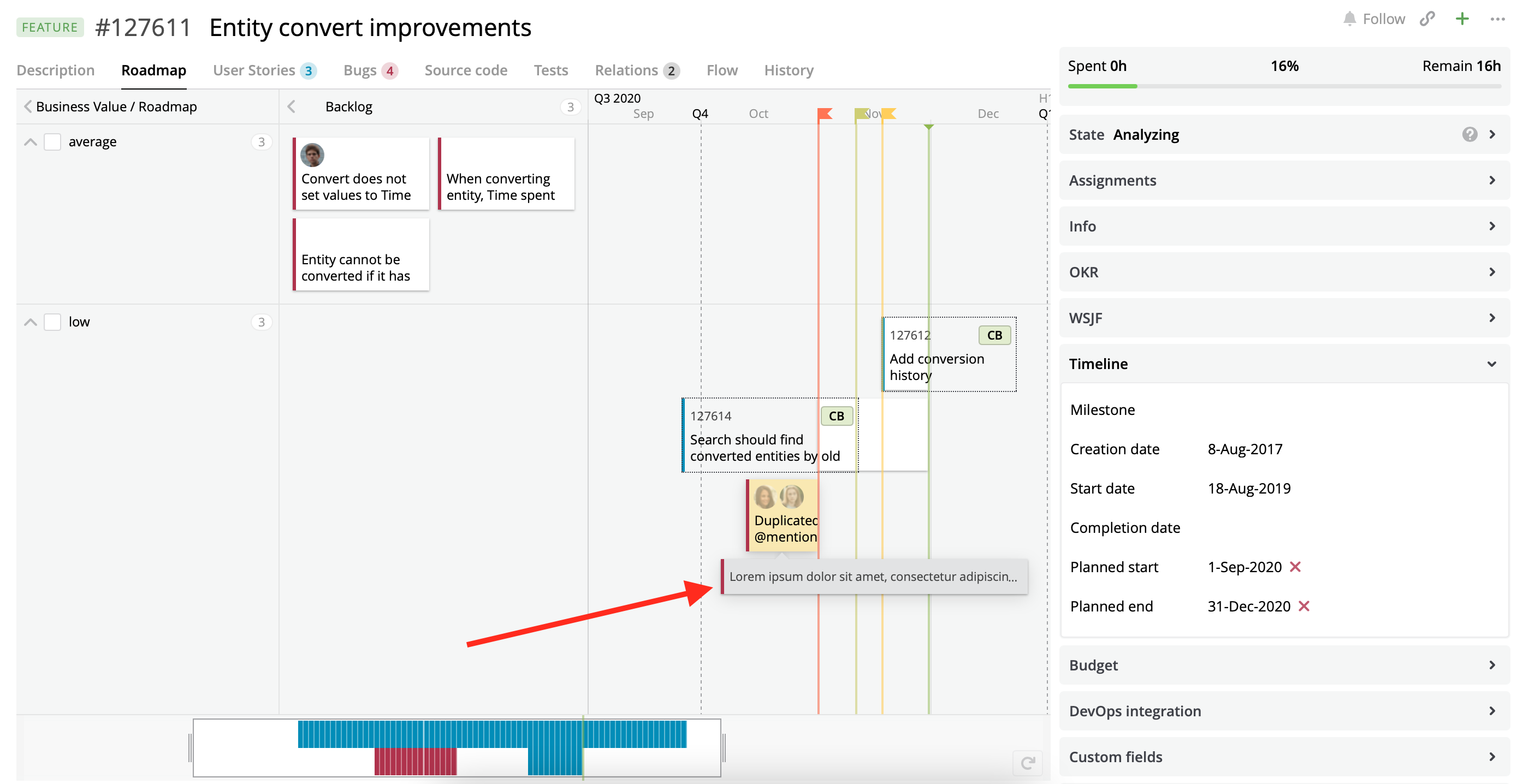
A Roadmap view with the configured cards displayed on a hover for Bugs.
Configure Milestones displayed on the embedded Roadmap view
By default, Targetprocess uses a Milestone entity to show it on a Roadmap view. You can hide Milestones via the showProjectMilestone property.
{
  "title": {
    "type": "string",
    "value": "Roadmap",
    "localize": true
  },
  "component": {
    "type": "component",
    "component": "roadmap.configurator",
    "properties": {
      "cardTypes": [
        "userstory",
        "bug"
      ],
      "startDateSelector": "PlannedStartDate",
      "endDateSelector": "PlannedEndDate",
      "cardSettings": {
        "userstory": [
          [
            {
              "id": "general_entity_id",
              "alignment": "base"
            },
            {
              "id": "project_abbr",
              "alignment": "alt"
            }
          ],
          [
            {
              "id": "entity_name_small_sizes"
            }
          ]
        ],
        "bug": [
          [
            {
              "id": "assigned_users",
              "alignment": "base"
            }
          ],
          [
            {
              "id": "entity_name_small_sizes"
            }
          ]
        ]
      },
      "hintCardSettings": {
        "userstory": [
          [
            {
              "id": "general_entity_id",
              "alignment": "base"
            },
            {
              "id": "project_abbr",
              "alignment": "alt"
            }
          ],
          [
            {
              "id": "entity_name_small_sizes"
            }
          ]
        ],
        "bug": [
          [
            {
              "id": "custom_rich_text_list"
            }
          ]
        ]
      },
      "cardFilter": "?Feature.Id is ${entity.id}",
      "globalDateRangeCalculation": {
        "daysBeforePlannedStartDate": 40,
        "daysAfterPlannedEndDate": 75
      },
      "dateScale": "quarter",
      "horizontalLane": "priority",
      "hideEmptyLanes": true,
      "zoomLevel": "s",
      "showProjectMilestone": false
    }
  }
}
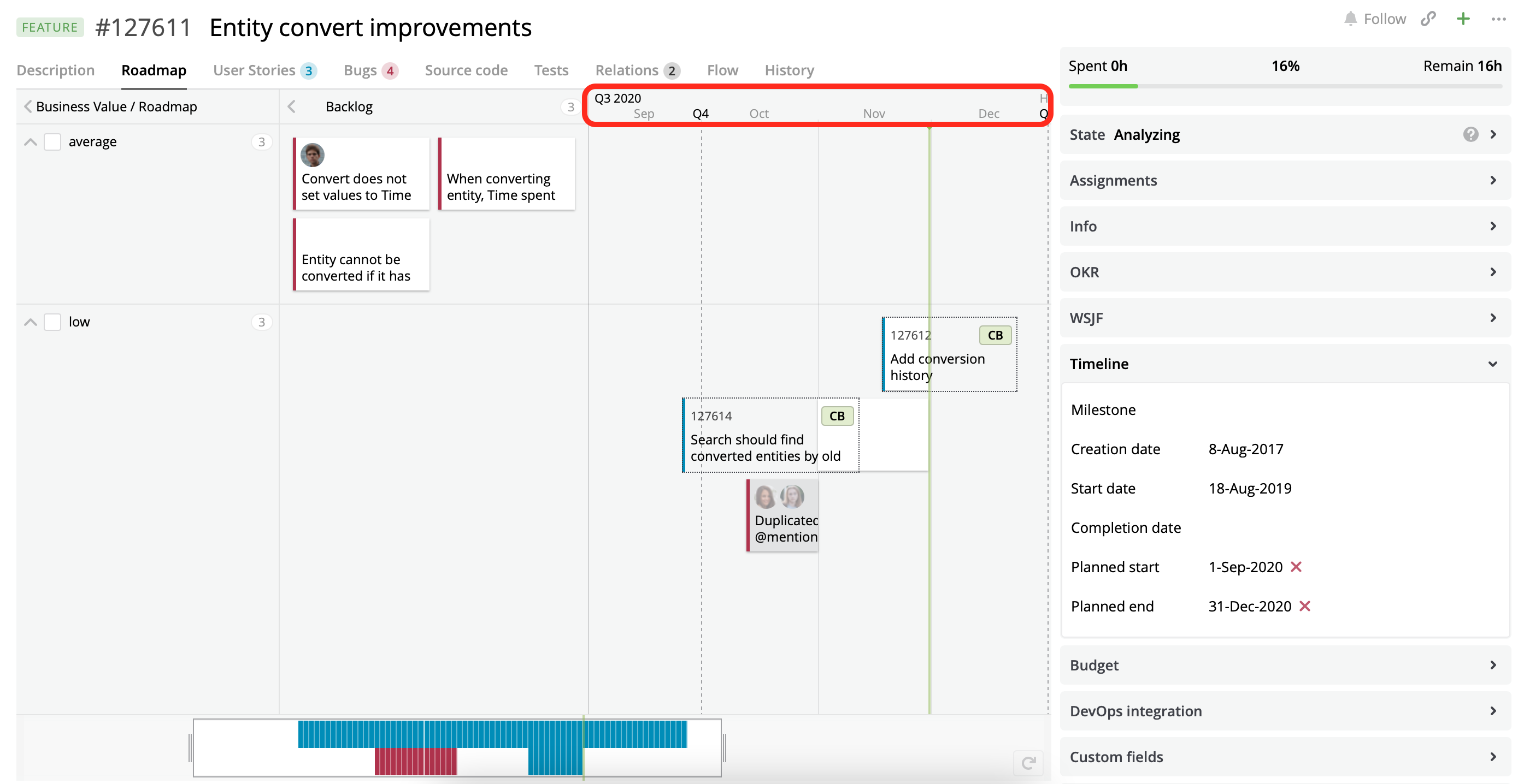
A Roadmap view with hidden Milestones.
We have added the ability for Targetprocess to use any entity as a milestone. Configuration of custom milestones can be done by adding the milestoneProviders property to the Roadmap configuration as below. A milestone has name, date, project, and cssColor fields.
{
  "title": {
    "type": "string",
    "value": "Roadmap",
    "localize": true
  },
  "component": {
    "type": "component",
    "component": "roadmap.configurator",
    "properties": {
      "cardTypes": [
        "userstory",
        "bug"
      ],
      "startDateSelector": "PlannedStartDate",
      "endDateSelector": "PlannedEndDate",
      "cardSettings": {
        "userstory": [
          [
            {
              "id": "general_entity_id",
              "alignment": "base"
            },
            {
              "id": "project_abbr",
              "alignment": "alt"
            }
          ],
          [
            {
              "id": "entity_name_small_sizes"
            }
          ]
        ],
        "bug": [
          [
            {
              "id": "assigned_users",
              "alignment": "base"
            }
          ],
          [
            {
              "id": "entity_name_small_sizes"
            }
          ]
        ]
      },
      "hintCardSettings": {
        "userstory": [
          [
            {
              "id": "general_entity_id",
              "alignment": "base"
            },
            {
              "id": "project_abbr",
              "alignment": "alt"
            }
          ],
          [
            {
              "id": "entity_name_small_sizes"
            }
          ]
        ],
        "bug": [
          [
            {
              "id": "custom_rich_text_list"
            }
          ]
        ]
      },
      "cardFilter": "?Feature.Id is ${entity.id}",
      "globalDateRangeCalculation": {
        "daysBeforePlannedStartDate": 40,
        "daysAfterPlannedEndDate": 75
      },
      "dateScale": "quarter",
      "horizontalLane": "priority",
      "hideEmptyLanes": true,
      "zoomLevel": "s",
      "showProjectMilestone": false,
      "milestoneProviders": [
        {
          "entityTypeName": "keymilestone",
          "filter": "?Features.Where(Id is ${entity.id}) and Gate is True",
          "color": "red",
          "dateSelector": "CustomValues.Get('Date').value"
        },
        {
          "entityTypeName": "userstory",
          "filter": "?Feature.id is ${entity.id}",
          "color": "violet",
          "dateSelector": "plannedEndDate"
        }
      ]
    }
  }
}
As you see from this example, you can customize which entity should be used as a milestone, which field of the entity should be used as a date for the milestone, which color should be used to draw milestones, and which filter should be used to reduce the number of milestones. In this example, two entities are used as milestones.
For the first milestone, we use an extendable domain entity Key Milestone that has many-to-many relation with the current Feature, filtered by custom field Gate set to true; custom field Date is used as a date field; milestones will be drawn in red.
For the second milestone, we use a User Story that belongs to the current Feature; native field Planned end is used as a date field; milestones will be drawn in violet.
color can be one of the below values: red, orange, yellow, olive, green, turquoise, blue, orchid, violet, and magenta.
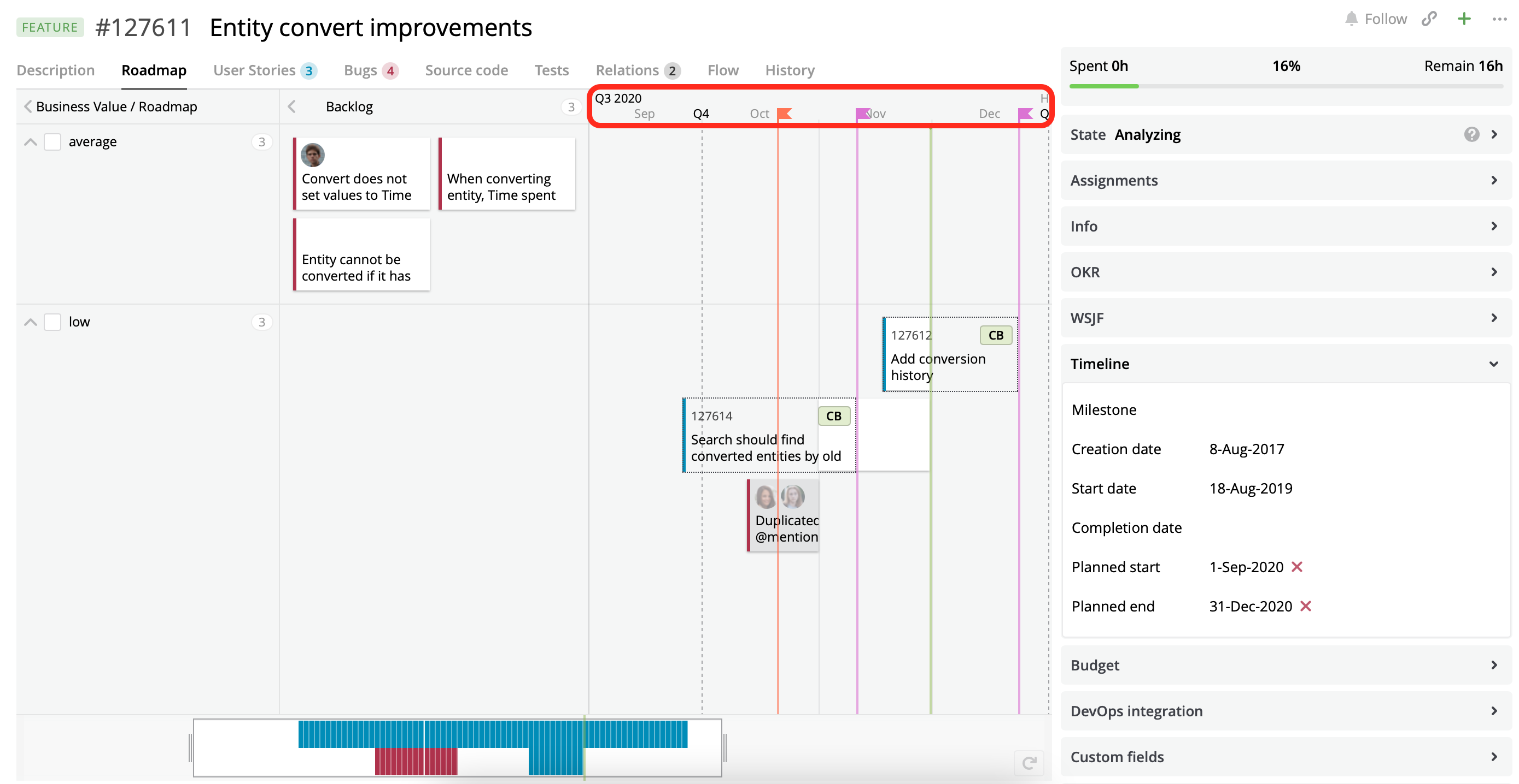
A Roadmap view with two customized sources of Milestones.
Configure visual encoding for cards displayed on the embedded Roadmap view
You can highlight cards displayed on the embedded Roadmap view using your own rules via visualEncodingRules property. The property has two fields: filter and color. Use the DSL filter for filter field to specify rules for visual encoding. Hex codes should be used for color field.
{
  "visualEncodingRules": [
          {
             "filter": "?Tags.Where(It is 'test')",
             "color": "D1D25F"
          },
          {
             "filter": "?EntityState is 'Coded'",
             "color": "cab"
          }
    ]
}
Updated 10 months ago
